5 Of My Favorite Concept Art Techniques For Games To Take Your Concepts To the Next Level
1 Focus On Story
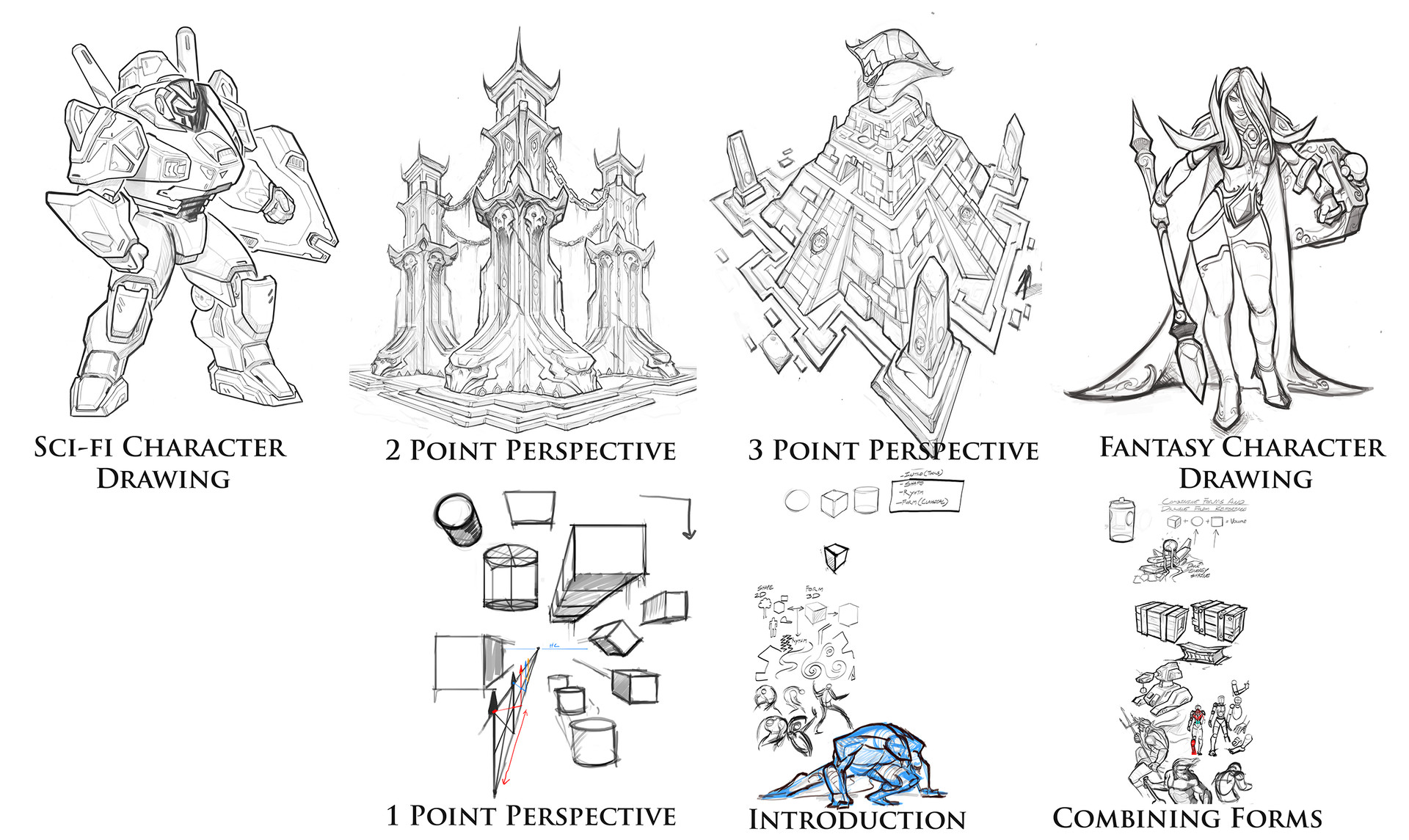
People often talk about "story" in their concept art, but it is truly rare to see elements of story in most modern day concept art these days. I could go through pages and pages of Artstation and see lots of very pretty art, with no sense of story whatsoever. Lots of times I see a whole lot of "guy on cliff looking into the distance" or "man with 16 layers of shoulder pads". Story helps your artwork be original and helps to keep you artwork from looking generic. Story elements can be sprinkled through a series of designs and in actuality every design decision you make should be a reflection of the story of the world you are trying to create. These elements will help add a sense of history and believably to your world. With my example above you can clearly see that I am exploring some type of Polynesian culture in a world where Sentient constructs and Magic Exist. Things look pretty worn and wonky giving the world I am creating a sense of history.
2 Distribute Detail Where you want people to look
Don't put detail all over the place, and don't put detail where you don't want people to look. In the example above "A" pulls you eye straight to that bottom left corner where all the detail is, while in "B" you are pulled around the image a bit more. Keep you detail focused in areas you want people to spend time looking at. People won't look at your art for more than a few seconds in most cases these days so make sure you don't waste any of that time confusing people with unnecessary or misappropriated detail.
3 Sweat the Small Stuff !!
You can develop a world from large to small, or you can develop small to large, it's up to you and what the needs of you project you are working on. I personally love to work small to large and develop a small prop or structure and let that inform the rest of the world I am trying to create. In the concept above I created a small mausoleum, and from the look of this small mausoleum I can infer that it is old, Gothic and filled with ominous power. The world seems stylized and whimsical but also has a dark undercurrent of necromancy and dark magic. After this I can start to explore the rest of the world, who built this structure? Is it part of a town or village? Who lit those candles? Did they light up on their own when dark spirits showed up? Developing a world in this manner lets you dive straight into many of the small details of a small part of you world and inform the rest of the world you are creating based on this one small piece of it.
4 Detail Adds Emersion
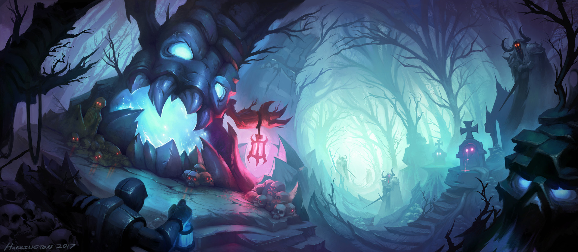
You might be thinking to yourself "hey you just said guy standing on cliff is generic", and your right I did, but look closer. As you check out this image you notice that there is a shark fin protruding from the characters back in the foreground, and that this is not just any ordinary man, it is my trademark Sharkman character. This small detail pulls you into the piece more and give this piece a sense of continuity with other pieces I have done with this character and in this world. The details of the skull fortress clearly give you the idea that this is a place of great danger and foreboding, making the story of Sharkman about to go on a great adventure the forefront of the piece.
-
5 Design From Game Angle
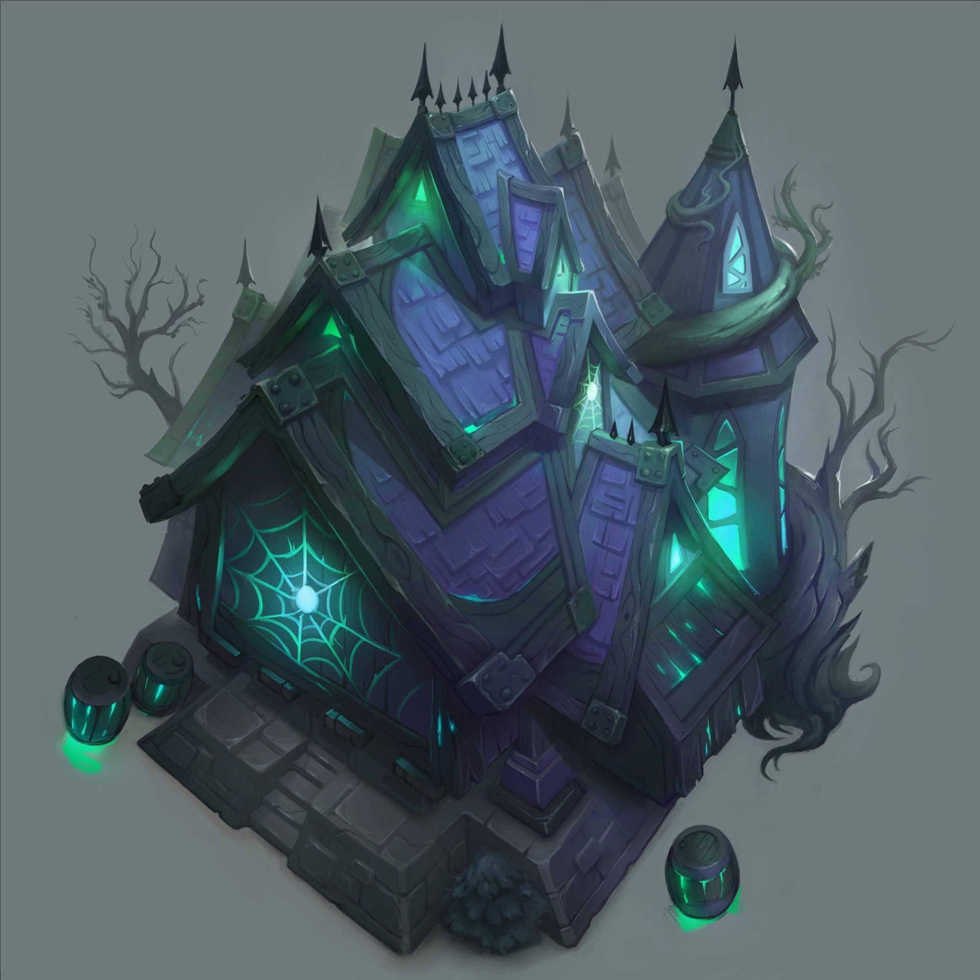
Design things from the angle they will been seen from!!! You don't know how many times I have designed something from ground view and had it look completely different from a top down game and Vice Versa. I see tons of concept art even at the studio level run into this problem. ALWAYS design stuff from the intended view angle, changing the view angle changes the silhouette, rhythm, design ratios and the read of the overall form.


